What is a landing page? And how does it work?

As simple as they sound, landing pages might be a confusing topic for site owners. What qualifies as a landing page and what doesn’t? Is every page you land on a landing page? What about Landing Pages in Google analytics? And, can you optimize them for conversion and search engines? Let’s dive in!
What is a landing page?
In digital marketing, a landing page is a page specifically designed for one purpose: to make a visitor convert. Whether it’s signing up for an event, subscribing to a newsletter, or donating money to a charity; a landing page aims to do just that. Therefore it’s completely focused on a single action. The idea is that this focus and taking away possible distractions increase the chance of a conversion. Marketers typically create these types of pages as part of a marketing campaign.
An example
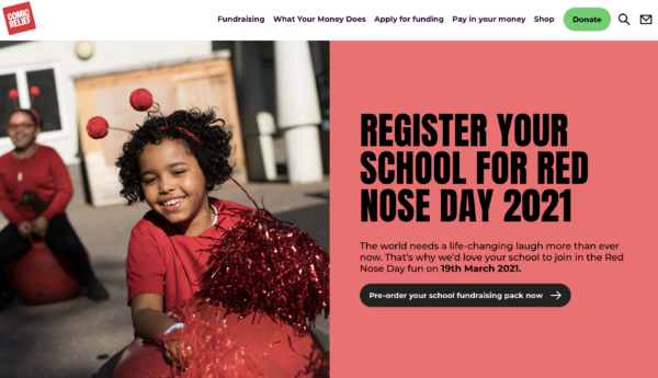
A nice example of a focused landing page for a campaign is this Red Nose Day landing page of Comic Relief:

The headline immediately conveys the message of this page: Register your school for Red Nose Day 2021. The text on the call-to-action is crystal-clear too. Perhaps a different color would make it stand out a bit more, but still, it’s hard to miss. The page is focused as a result of its clean design and the absence of distractive elements. Moreover, if I’d work at a school the image of the happy little girl would make me want to participate right away.
This screenshot shows what you see above the fold on the desktop version of this site. If you scroll down you’ll find some other elements, like options to donate money or links to explanations where the money goes. You could think of these secondary buttons as distractions, but because they only appear when you scroll down, the first view of the page remains focused on its primary goal: getting schools to register for this event.
How does a landing page work?
Imagine getting an email from a local venue announcing a concert of your favorite band. Woohoo, you’re super excited to get tickets! You click on a link and end up on the homepage of the venue. You start looking for the schedule. When was it again? Maybe better use the search bar? O wait, a banner showing another awesome concert too. Hmmm…Maybe first discuss with your friends which band they’d like to go to?
The internet is full of distractions and landing pages of a marketing campaign try to get rid of all these distractions. In the above example, if you would have ended up on a page purely focused on this concert, providing the necessary details and an eye-catching call-to-action leading to the cart you probably would have purchased the tickets already.
If people click on a campaign link in your newsletter or social media post, you’ve already somehow sparked their interest in your event, charity or, whatever you’re promoting. As they’ve been exposed to the content they’ve clicked on, they probably already have a bit of context on the topic. That’s why they’re likely to be further in a user journey as someone landing on your site from an informational search query in Google. This means chances of conversion (subscribing, getting tickets, or buying something) are higher. So it does make sense to focus on the action of the user. Now you just have to make sure to make this action as easy as possible!
How to optimize them?
When you create a landing page for marketing purposes you first have to decide what you’d want people to do on that page. This shouldn’t be too hard if you have a clear goal for your campaign. In the example above, that would be selling tickets for that concert. If you know your goal, you can start optimizing the page for the target group and add all essential elements that should be on the page.
Essential elements: Inform and convince
Obviously, you should tailor a landing page to give your users what they need and convince them to participate at the same time. Therefore it’s indispensable you know your audience. Nevertheless, some elements are so common you can find them on almost every great landing page. We’ve listed them here for you:
- a headline that conveys the message: what should the user do here?
- a call-to-action (CTA) or a short form people can fill in right away
- some essential details the user would want to know before clicking the CTA (for instance, time and place of an event)
- visuals: an appealing image or short video (let’s say if you can win a state of the art coffee machine it makes sense to show it)
- social proof (a quote of a happy user or participant, for instance)
- in case of a purchase or donation: payment options
Remember: Keep it short and simple! To add more focus to your page you can even get rid of the menu, as it might lead people away from your page. Also, go easy on the links to other pages; they can do the same. If you do need to add links to other pages, consider adding them below the fold. The same counts for any secondary actions, like the donation button on the Red Nose Day page.
Test!
Don’t forget to test the page! If you build a landing page you’ve likely made some assumptions about what you’re audience needs/wants. Especially with these kinds of pages, focused on conversion, it pays off to A/B test them thoroughly! And, when you’ve built that one awesome landing page, be sure to clone it with the Yoast Duplicate Post plugin and use it as a template for your other landing pages.
Here you’ll find more tips on optimizing a landing page.
What about Landing Pages in Google Analytics?
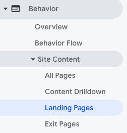
Landing pages of a marketing campaign are not to be confused with Landing Pages in Google Analytics. Landing Pages in Google Analytics are just a list of pages on your site that get the most traffic from external sources.

While a popular marketing landing page as mentioned above could be in this list, it doesn’t necessarily have to be. For instance, in our case, our post on choosing a focus keyword is one of our top Landing Pages in Google Analytics. But it wouldn’t fit the above the description of a landing page. It’s an explainer post helping people with setting the right focus keyphrase on a post they’re writing. It’s an informative post, not aimed at convincing people to sign up for something. People land on this page as they’d like to learn something or need help. Bombarding them with buttons would probably scare them away.
If some of your campaign’s landing pages are in this list, this post on the power of Landing Pages in GA will help you to analyze their performance though!
Landing pages and SEO
Do you want your landing page to rank? I can hear you say: Yes, of course! I want to get as many users as possible on this slick landing page I’ve created and tested! But, don’t forget that a page specifically designed for a campaign which mostly gets visitors from newsletters and social media, might not always be the best fit for searchers in Google.
You’ll have to ask yourself, is this the page people want to find when they’re searching for something? Or, would they like a more extensive article on the topic they’re interested in? Are they ready for subscribing or buying? Or do they have a different search intent? Where are those people in the user journey? As you’ve designed this page to convert, it might not be the best fit, apart from people actually searching for your event, contest, or campaign.
Of course, you can make sure the page is optimized for the exact term of the event. For other terms, it might be harder to rank with a page that is mostly focused on conversion and probably doesn’t have a lot of copy. Placing enough internal links to this page might as well help it rank for the exact term. If you do want to add content to the page, maybe even with links to more information on your site, you can best add it below the fold, as it might prevent people from converting. But again, ask yourself: what exactly is your goal of this page? It might be better to optimize it for one goal only!
Product pages vs. landing pages
There’s a lot of overlap between product and landing pages. Some principles definitely apply to both: Both pages should be focused on conversion, with a clear headline, call-to-action, social proof, and probably a nice image or video. But a campaign often has a more temporary character. Also, your product page probably shows more details and maybe even a related products section, making it slightly less focused than a marketing campaign’s landing page. And of course, you’d definitely like your product page (or category page) to rank! If you want to dive into optimizing your product page, go read our post on product page UX and product page SEO.
Local landing pages
Last, but not least: you can also have local landing pages on your site. They serve a completely different purpose as the campaign landing pages we’ve discussed above. If you have a business with several physical locations, it’s best practice to create a landing page for every location you have and optimize it for that local audience. If you want to learn how to do this (with a little help of our Local SEO plugin) you should read our post on local landing pages.
Conclusion
In digital marketing, a landing page is a page designed to trigger a specific action of the user. It’s often created as part of a campaign and aimed at conversion: the page should convince the visitor to subscribe, participate or buy something. Therefore it’s very focused. It’s not to be confused with Landing pages in Google Analytics, which is a list of pages people land on from external sources. Depending on the goal of the page you can try to optimize the page for search engines too, but sometimes it’s better to keep it solely focused on conversion. Whatever you do, think about the goal of your page first!
Good luck with your landing pages. And feel free to drop your questions in the comments.
Read more: How to optimize your landing page »


Discussion (16)