Writing with Gutenberg: Testing from a writer's perspective

Gutenberg is coming. It’s a really big thing in the world of WordPress. At Yoast, we are really busy making sure our Yoast SEO plugin integrates nicely with the new editor. So we talk and think and a lot about Gutenberg. But as a writer, I didn’t really use Gutenberg yet. And this made me wonder: What is it like to use Gutenberg? Does writing with Gutenberg feel any different? Is it easier? Will I have more fun? Is it a good writing experience? In this post, I’ll share my thoughts on the new editor from a writer’s perspective.
Update January 21, 2019: We’re happy to announce we feel it’s safe to update to WordPress 5.0 now! Always make sure to test, though.
What is Gutenberg?
Let’s start by answering the question what is Gutenberg? Gutenberg will become the new default editor of WordPress. The biggest change from the current editor is the introduction of blocks. In the new editor a paragraph, a title or a picture will be a block. You can add a new block, choose what kind of block it will be, and easily edit it the way you want to. Blocks are flexible and can be shifted dynamically around the page.

Read more about the Gutenberg project on WordPress.org. The Gutenberg editor is going to be released in the 5.0 update of WordPress. It is not clear when exactly this update will appear, but it should happen somewhere in Spring 2018.
Starting out as a skeptic
I have to be honest. I was rather skeptical about Gutenberg. Prejudiced even. But, I installed the Gutenberg plugin on my personal website and started writing a blog post. Trying to be as open minded as possible. And, I can’t deny: it was really easy. I even forgot for a moment I was testing out a new editor. It didn’t feel weird or new to me at all. Main conclusion: I’m really enthusiastic about Gutenberg.
Intuitive and easy to use
The Gutenberg editor has an intuitive design. For me. And if it’s intuitive for me, it basically is intuitive for everyone. I am not that savvy. It didn’t take much effort to find out how to choose a new heading. It took me just a little bit of clicking to figure out how to insert a picture in my blog post. I could do all the things I do while writing a blog post, just as fast as I always do. At the same time, my screen was rather empty. I liked that. There was little distraction.
Some great advantages over the old editor
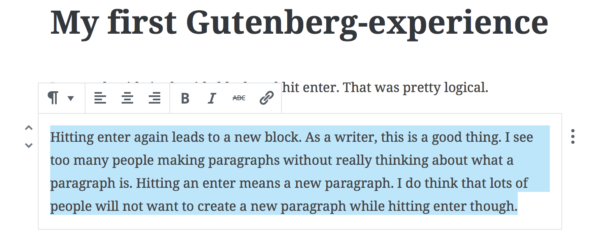
The Gutenberg editor has some great assets that could genuinely help people to write better texts. I like that every time you hit enter, a new block emerges. If you go on typing, you’ll create a new paragraph. In my opinion, most writers do not think enough about why they start a new paragraph. They just put whitespaces in when they feel like it. Hitting enter in Gutenberg will create a new block. I believe this will help people to think more about the structure of their text.

I also love the fact that the editing options are not hidden away at the top of your post. If I want to add a link in my text in the old editor, I have to go all the way to the top of my blog post. That’s a lot of scrolling. I think I will add much more links to my text when using Gutenberg. Because it is so much easier. And adding (internal) links to your blog posts is important for SEO. Inserting pictures has become much easier too.
Some downsides…
I understand why dynamic blocks are appealing. And I do think the flexibility of the blocks will come in handy to get the correct place for a picture or a quote. However, I do not like the fact that it’s so easy to dynamically shift paragraphs and headings. I’m a bit scared that people then feel free to shift their paragraphs while writing. And, from my point of view, the best texts are written after the author carefully established the structure of his or her argumentation. No dragging and dropping there.
Another downside was my experience as I tried to copy and paste a text from Google docs in the Gutenberg editor. In the current editor it takes a lot of work to get the formatting of your article right. That did not work perfectly in Gutenberg either. It does strip out the superfluous HTML code though. Other things went well, like transferring headings, but some paragraphs were transformed in a single block, while other paragraphs were merged together in one block. I could not figure out why. As lots of writers won’t write in the WordPress backend, but in another editor, this experience should be really smooth. A flawless experience would be a tremendous improvement compared to the current editor.
Conclusion
For me, writing with Gutenberg was not all that different from writing in the old editor. And, scrolling down gave me the Yoast SEO meta box, with suggestions to improve my writing and SEO. Yoast SEO already works. The Gutenberg editor offer lots of chances to improve our plugin. We’re working on awesome redesigns to make the writing experience even more awesome. So stay tuned!


Discussion (43)