Visually direct and captivate your visitors

In the last month I’ve been speaking at a few conferences with a talk I’ve dubbed “The Psychology behind Conversion”. In this talk I’m trying to explain why everyone who maintains a website should be interested in psychology and how it can help them.
Being interested in psychology, especially when applied to the web, is more than just reading Cialdini’s Influence. Don’t get me wrong by the way, that book is awesome. But there are just so much more psychological processes at work than people are probably aware of. One of the most important ones, to my mind, is visual attention. People undoubtedly understand that attention is of importance when it comes to doing, well, anything really. So the same goes for visiting websites. But in my opinion it is not just attention, but visual attention that’s most important for visiting websites.
Visual attention
There are a lot of processes playing their part in this. We are very visual beings, and not being able to see, especially when you’re used to seeing, impairs us more than anything. It literally helps us understand our world. Our sight can even influence our other senses, such as taste.
So it’s of great importance to direct your visitor’s visual attention to those parts of your website you want them to see. To make sure you’re keeping their visual attention. In this post, I will discuss three aspects of visual attention: visual cueing, facial distraction and perceptual incongruence.
Visual cueing
Visual cueing basically means directing your visitors’ gazes. You can do this with colors or textual directions, but the most effective way is shapes. And there’s one shape that’s unparalleled when it comes to visual cueing: the arrow. Now, I use the term ‘arrow’ in a broad term, as it can be an actual arrow, or more of a triangle shape.
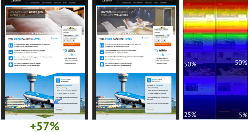
On wheelofpersuasion.com you can find a great explanation on this. Especially this picture makes it very clear:

So adding those simple triangles in the images resulted in a huge increase in people scrolling down to the bottom of the page. But even more amazing: they had a 57% increase in conversion. So this already shows that keeping and directing your visitor’s visual attention pays off. Obviously, this is a process that every parallax website should be taking advantage of!
Facial distraction
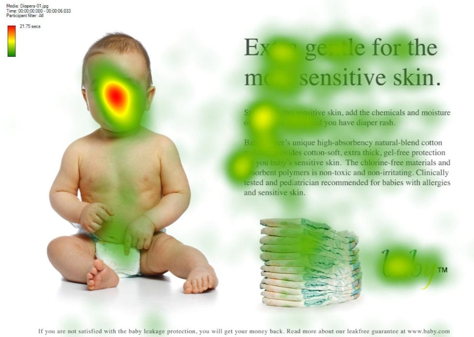
The second aspect of visual attention I would like to discuss is facial distraction. If you’re interested in usability, eyetracking, conversion, or just read too many blogs, you’ve probably seen this image:

What you see on this visual heatmap is a classic example of facial distraction. People will look back at the baby’s face a lot more than they’ll actually read the text. This works for any kind of picture of a person. It doesn’t have to be a baby. It doesn’t even have to be a real person; avatars such as the ones we use will render the same effect!
So I shouldn’t use pictures of people?
Of course you should! Adding pictures of people to your website adds credibility and a sort of personality to your site. As long as it aren’t stock photos. All I’m saying is that you should make these pictures work for you.
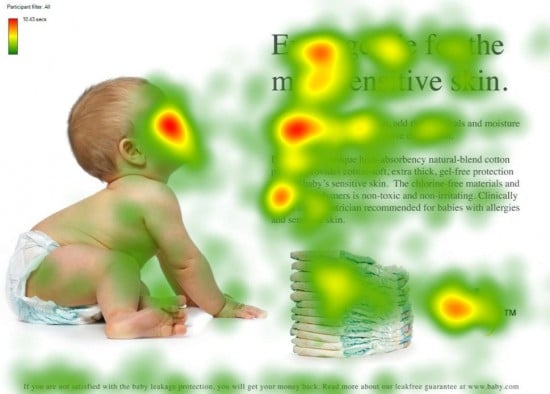
When babies are about 9 months old, their mothers will start pointing and looking at objects to try and direct the baby’s attention to that object. This is called joint attention. And this is exactly the process you should be using to direct your visitors’ gazes to where you want them to go. The follow picture will probably explain it much better than I can:

As you can see, people will look where the baby is looking. Again, this works with just about anything that we can recognize as a (depiction of a) human face. You might’ve noticed our WordPress plugins page has avatars that are all looking toward the text. This is no coincidence ;)

So definitely show pictures of people on your website, but also make sure they’re not distracting your visitors. Have these pictures help you direct your visitors’ attention instead.
Perceptual incongruence
The third aspect of visual attention I want to discuss is my personal favorite, probably because it’s a difficult word. However, the psychology behind it is pretty cool as well. Perceptual incongruence is basically a process where we automatically pay attention to things we don’t understand. Let me show you a video to try and explain it:
12 seconds into the video, you’ll notice that a glass is tilted sideways, without the liquid spilling out. This is something that our brain interprets as ‘weird’. It is not what’s supposed to happen, so we automatically and involuntarily pay attention to it. And for the ones who think this is just a fluke or a gimmick: within 5 seconds the Bacardi logo pops up.
However, you should be careful with this process. If there are a lot of distractions from this perceptual incongruence, such as other moving or bright elements on your website, its effect could be negated. The perceptual incongruence process will be negated by another process called ‘selective attention’. People should not be able to easily focus on, or be distracted by, other things. Simply because this would mean they won’t see the unexpected element which should trigger the perceptual incongruence process. This is all probably best explained by another video:
Did you notice anything strange? Most people actually don’t. And that’s because people were specifically instructed not to take notice of anything else. So the key here is to surprise your visitors in a place where there aren’t any (or a lot of) other distractions. If you surprise them there, they will pay attention. And once you’ve got their attention, be sure that you make it count!
Over to you
These are just a few of the psychological and visual triggers you can use to direct your visitors’ gaze and attention. Maybe you’ve heard about a few others that you thought were awesome? Or maybe you have something to say about this post? Let me know!


Discussion (14)