Twenty Twenty-One: New default theme for WordPress 5.6

Almost every year, WordPress gets a new default theme. This theme is bundled with the last major release of WordPress for the year. This time, we welcome a new theme in WordPress 5.6. The theme is called Twenty Twenty-One and it is a stunner. It was designed by Automattic’s Mel Choyce-Dwan and built by a team of developers led by Carolina Nymark. Let’s meet the new theme and one of its creators: Carolina.
A beautiful and practical theme for WordPress
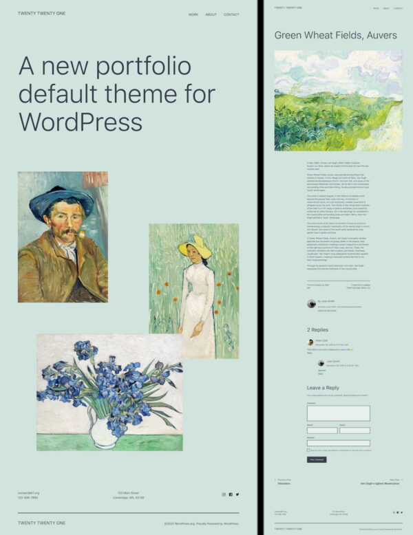
Twenty Twenty-One is a great theme with a design that makes it stand out. The colors, the whitespace, the typography — it’s all very clean and well-thought-out. The design is like a new canvas waiting to be painted! And you can paint it in any way you want, because of block patterns.
As usual, Yoast contributed to the release of WordPress 5.6. We have a dedicated WordPress Core team, led by Francesca Marano, that works on all part of WordPress — from documentation to core code. This time, we also worked on the brand-new theme Twenty Twenty-One.

The design
Design is subjective, of course, but in our opinion, there hasn’t been a default theme quite like this. Twenty Twenty-One is a knock-out. It’s clean, has great typography, and a selection of color palettes that will find use in a lot of situations. It even has an awesome dark mode, built by Ari Stathopoulos.
Clean and fast
One of the most eye-catching things about Twenty Twenty-One is how graceful it looks. If you look closer, you’ll also notice that it turns out to be a fast theme. The theme avoids the use of unnecessary complex JavaScript behind the scenes and, since it uses a native font stack, doesn’t load additional web fonts. This all contributes to a major speed boost.
Flexible, thanks to block patterns
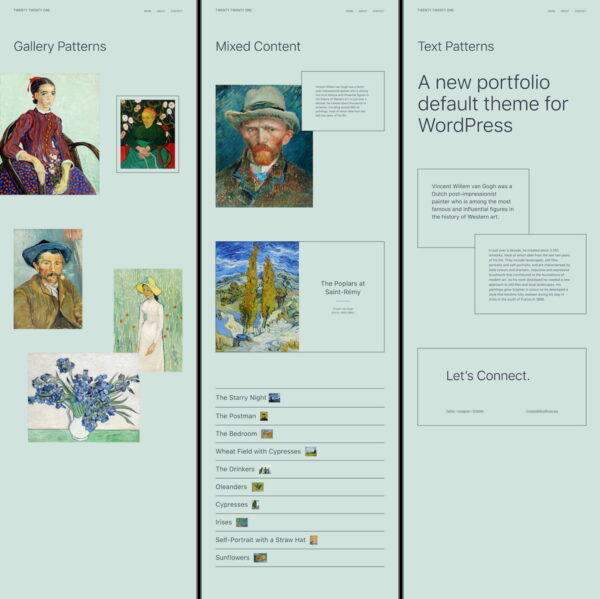
When you dig deeper into Twenty Twenty-One, you’ll notice all these awesome color palettes and flexibility in the theme. You can really paint this canvas. The development team added support for block patterns and shipped the theme with a selection of patterns that give you great flexibility in adapting the theme to your liking. These patterns were designed by Mel Choyce-Dwan with the help of Kjell Reigstad. Of course, you can always make your own patterns that fit your use cases.

Accessibility first
One of the goals of this project was to make the new theme as accessible as possible. The team wanted to comply with accessibility guidelines wherever they could. Since the design is so elegant, it makes it easier to build in an accessible way. You can use the theme with keyboard navigation and it’s screenreader-proof. Yoast’s in-house accessibility expert, Andrea Fercia, evaluated the theme and made improvements.
How did Twenty Twenty-One come about?
The development team worked on Twenty Twenty-One alongside the rest of WordPress 5.6. The people involved in the project first met in June 2020 and consisted of a team of six designers and developers. Unfortunately, due to various reasons, several of them abandoned the project at an early stage.
Carolina Nymark is from Stockholm, Sweden and she’s been building WordPress themes for over ten years. Carolina is a very active and respected member of the WordPress.org community. Also, she is one of the Themes team global representatives. She volunteered for a place in the release team for WordPress 5.6 and ended up leading the development team for the new default theme Twenty Twenty-One. We talked to her about her experiences building the theme.
Designing a new theme
The design process started on Pinterest, says Carolina. The team had different mood boards with inspiration, with different types of typography and layouts. From these styles came a selection of three topics:
- Speak Up: Black with a bold type and an orange secondary color, this was inspired by current events like the civil rights movement, protests, and hand-made signs.
- Magazine: Consisted of large serif fonts, white and stylish with spots of gradients in the background.
- Portfolio: A colorful design, with elements with clear borders and lines, focus on large images.
Carolina: “It was very interesting to follow the design process. All three designs had their merits, and the topic of the first one felt important, because of everything that has happened in 2020. It was a theme design specifically to help people get their voices heard. This would fit nicely with the WordPress mission of democratizing publishing. In the end, I was glad that the third design was picked, the portfolio variation, because it was the most versatile. This is something you can use to create many different types of websites.”
Building the theme
With the design finished, the development team led by Carolina could start their work. Her team consisted of several developers that devoted some of their time to help get this theme off the ground. To help Carolina focus on the task at hand, Yoast stepped up and sponsored her for the duration of the process. Since the collaboration was working so well, Yoast asked Carolina to join our WordPress Core team full time.
Several Yoast developers helped out, developed parts of Twenty Twenty-One, and brought structure to the project. The initial goal was to get the theme ready for inclusion in Beta 1. This would be the first time you get to test the new version of WordPress as a whole, including the default theme. For this, we put together a temporary team for a two-week sprint. Rolf Siebers, Guido Offermans, Simon Resok from Yoast’s front-end department joined the WordPress team to lend their expertise and expedite the process.
Building from an existing theme
To improve the process and to get a solid foundation, the team decided to work off an existing theme to make the work easier. Carolina: “We started from a theme called Seedlet which was built by Automattic. We kept the base of the theme but needed to remove some features and add our own. One of these features was a menu that can be used both with text links and social media icons.”
Twenty Twenty-One being a default theme brings another challenge according to Carolina: “You can’t narrow down the target audience. There isn’t one specific use case, everyone is your user, with different wants and needs. The theme needs to work for a portfolio site, a blog, or a small store or restaurant. You have to select the features you want to include and limit yourself. Getting carried away is easy. Not only that, because if you include too many features the theme may become difficult to use.”
Looking back, Carolina is very proud of the work everyone has done. The end result is stunning — a great-looking, lightning-fast theme that works well in a lot of settings. “I can’t wait for the world to see what we’ve built!”
The learnings
Building something as part of an open-source project is hard work. It’s crucial to manage expectations, get everyone on the same path, and to communicate properly. The last one was the hardest, says Carolina: “Yeah, the technical part was hard work, but that wasn’t the most difficult part of the job. Leading a team is about finding ways to communicate so that no one gets upset, including me. Loads of people helped me with this, including Francesca Marano, and many other members inside and outside the team. Besides all the Yoasters mentioned, I would like to give a shout-out to Justin Ahinon and Tim Hengeveld who helped out along the way. I’m grateful for all the help.”
Try Twenty Twenty-One now!
WordPress 5.6 comes with a lot of great features and a beautiful new theme. Be sure to try out Twenty Twenty-One and go make some awesome layouts with it. At Yoast, we’re proud of everyone who spent many hours designing and building it. Enjoy using it!


Discussion (21)