How to perform an SEO audit (with checklist)

An SEO audit is a health checkup of your site. It allows you to know what works and what does not, and it allows you to make improvements based on what you find. This can lead to improved performance — both on the search results pages and how visitors engage with your website.
What is an SEO audit?
An SEO audit looks at how well a website performs in search results to find areas that need work. It helps find technical SEO problems, analyze on-page elements, evaluate Core Web Vitals and site speed, and analyze user experience and content quality. An SEO audit also looks at outside variables like backlinks and rival tactics to identify areas for improvement. Making sure your website is optimized for users and search engines can help it rank better and attract more organic traffic.
A helpful guide
An SEO audit checklist
Read on below for the step-by-step process, but here is an SEO audit checklist that will help you get started quickly.
⬜️ Crawl your website using Screaming Frog (or similar tools)
⬜️ Analyze your site with an SEO audit tool (e.g., Semrush or Ahrefs)
⬜️ Pull reports from Google Analytics and Search Console
⬜️ Check the user experience (check CTAs, menus, etc)
⬜️ Audit website content (duplicate and thin content)
⬜️ Check if you are using canonical tags correctly
⬜️ Test Schema markup
⬜️ Test mobile responsiveness and Core Web Vitals
⬜️ Check user engagement
⬜️ Track metrics regularly
⬜️ Check Search Console reports
⬜️ Create a centralized spreadsheet for findings
⬜️ Schedule regular audits and check-ins
Step 1: Preparing an SEO audit
To make your site audit a success, you must prepare well. You need to collect the right information about your website using SEO audit tools, understand how to diagnose issues and prioritize fixes.
Crawl your website with Screaming Frog (or something similar)
The first step is crawling your website with crawler software. This helps find technical SEO issues that otherwise wouldn’t be so visible. Screaming Frog is one of the most trusted names in this, but Sitebulb is another highly recommended one. The free version of Screaming Frog crawls 500 URLs, but you can upgrade if needed.
Crawling your site is easy; simply download and install Screaming Frog. Open the tool and enter your site’s homepage URL. Then, hit Start, and the crawl will run. Once the scan is complete, export the data into a CSV file for further sorting and prioritization.

What to look for?
Screaming Frog generates a ton of data, so it’s good to prioritize the outcome. Scan for missing, duplicate, or overly long titles and descriptions. Each page should have unique, targeted metadata. Find pages or links that return (404) errors as broken links frustrate users and hurt SEO. Then, identify oversized assets that slow your page load time, such as images, JavaScript, and CSS files. Last but not least, make sure that canonical URLs are properly implemented to avoid duplicate content issues.
Use an all-in-one SEO audit tool (Semrush or Ahrefs)
In addition to a technical crawl, Semrush or Ahrefs provides other insights such as keyword rankings, backlink health, and competitor performance. The SEO site audit of these tools gives you a technical health score from which to work.
In its recommendations, you’ll find many things to fix, like pages blocked by robots.txt or issues with internal linking. The tools also review the quality and relevance of your backlinks and give you ideas on how to get high-quality new links. You’ll also get keyword rankings to track how individual pages perform for target keywords. Identify opportunities to refine content or target new search terms.
Pull data from Google Analytics and Search Console
Combining all these insights with your site’s user behavior and engagement data will make your SEO audit come alive. It helps you understand how people use your site and how they experience it to pinpoint pages to improve. Export your findings from Google Analytics and Search Console to include in your website audit comparisons.
Check the top-performing landing pages in Google Analytics and their engagement rates. Pages with low engagement rates may have poor content or a disconnect between user expectations and page design. Also, look at session duration and exit rates to find pages where people quickly leave your site.
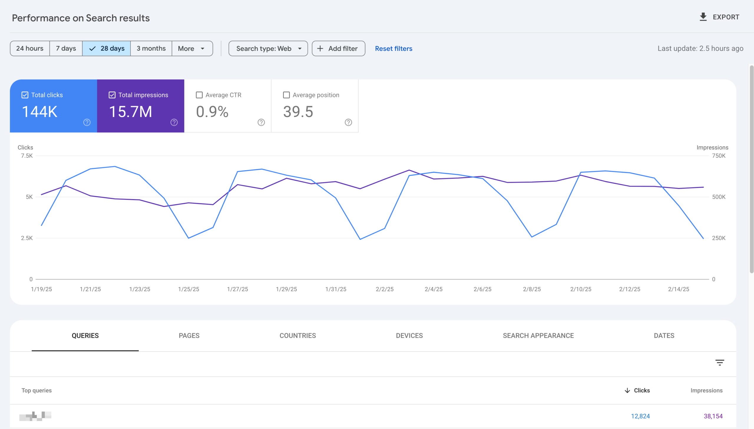
You can use the Performance Report in Search Console to see which pages and queries drive the most clicks and impressions. This will also highlight low CTR pages — ranking well but failing to attract searchers. Then, check the Page Indexing Report for crawl errors, warnings, or blocked pages and review the Core Web Vitals Report to find pages failing on speed or usability metrics. Remember that you don’t have to fix everything, but prioritize the most important issues you feel will have the most impact.

Create a centralized spreadsheet
Once you have all the data, please combine everything in a big spreadsheet. How you set this up is up to you, as everyone uses something different. But you could use something like this:
- Page URL
- Technical issues (e.g., broken links, slow load speed)
- Engagement metrics (e.g., engagement rates, time on page)
- Keyword rankings
- Optimization notes (e.g., missing metadata, duplicate content)
- Priority (High, Medium, Low)
Remember that one URL can have multiple broken links and rank for hundreds of keywords. To make the sheet manageable, use various tabs for each main issue and list all URLs with that issue. This spreadsheet will guide your fixes after the initial website audit process.
Minimal SEO audit (optional)
Not every audit needs to be a deep dive into your site. Sometimes, you don’t have the time but still feel the need to work on your site. In this case, you could do a simpler, quicker health check and evaluate specific regions of your site to see if these perform well. Such a minimal SEO audit is a streamlined version of a full website audit to find and fix critical performance issues.
Here’s a basic framework for a quick website audit:
- Check that your site is indexed by searching
site:yourdomain.comin Google. - Run a Google PageSpeed Insights test for slow-loading pages.
- Examine the titles and meta descriptions of your most important pages (e.g., homepage, service pages, and key sales pages).
- Check for broken links using Screaming Frog or manually check in your navigation.
This lightweight SEO audit still finds high-priority issues without the time commitment of a full review.
Step 2: User experience & content SEO
The next step is to see how people perceive and interact with your site. Look at the user experience and see if you can find things to improve. You can get people to your site by using high-quality content aimed at the right search intent and audience.
Improving the user experience
Can your users find what they need easily? If not, they might leave your site quickly. Giving them a good experience will do wonders in the long run. In your SEO site audit, start by diagnosing common UX factors.
Make sure the colors match your branding and are easy to read. Look at contrast, as this is especially important for buttons and links. Make CTAs (like “Buy now” or “Learn more”) stand out visually.
Check if the most important design elements are above the fold. Key messages and CTAs should be visible without scrolling. Think of this as the headline act—it must grab attention immediately. After your site audit is done and you move to fix things, add customer testimonials, third-party endorsements, and security badges (e.g., SSL or payment protection signs) to build credibility.
Give special attention to your menus, test drop-downs, and search functions. Remember to look for any issues with breadcrumbs.
Audit website content
A large part of SEO consists of improving written content, so review its quality and improve where necessary. The Semrush/Ahrefs site audit should have given you many pointers. With this list, start working on the following.
Check the keyword targeting of your content. Make sure that each page represents a primary keyword. Ahrefs and Semrush show which keywords your pages rank for and identify gaps.
Check for duplicate or thin content. Avoid weak, duplicate, or low-value content. Where necessary, merge similar pages into one in-depth article. Provide actionable, valuable content.
Remember Google’s Helpful Content standards. Create content that delivers real value and focuses on user intent. Your content should answer questions with actionable, audience-focused solutions. Last, you demonstrate Experience, Expertise, Authoritativeness, and Trustworthiness (E-E-A-T). In the audit, check if you use good author bios, cite reliable sources, and link references where necessary to develop expertise and trustworthiness.
Internal linking and related content
SEO is not just about getting users and search engines to your site —it’s also about keeping and showing them around. One of the most powerful ways to do this is through internal linking, so be sure to include this in your SEO audit.
Check how you link your most important pages, like cornerstone articles or product categories. Your content should have a couple of links based on relevance and importance, but not too many. In addition, you should include a related content section on your pages to encourage further reading.
Look for anchor text with generic phrases like “click here” and add these to a list of issues to fix after the audit. Anchor text should include relevant keywords or describe the linked page.
An internal search feature is another important aspect of showing people around your site. Make sure that your search bar provides relevant results, especially on large websites. Watch out that you don’t index these pages. Otherwise, you end up with all these search pages with random typos in the search results. Don’t forget to monitor what people search for to inform your content strategy.
Step 3: General on-page SEO audit
On-page SEO involves reviewing elements on individual pages to ensure they’re easy for search engines to understand and provide a good user experience. During an audit, the focus isn’t on making fixes but on assessing page-specific issues that need attention. The findings from this step are compiled into a roadmap or task tracker for later action.
Evaluate page titles and meta descriptions
Review your site for missing, duplicated, or improperly formatted page titles and meta descriptions. Use SEO tools to crawl the site and identify:
- Pages missing titles or descriptions.
- Titles or descriptions that are too long, too short, or cut off in search results.
- Duplicate titles or descriptions across multiple pages.
Assess heading structures (H1 to H6)
Headings are key in structuring content and signaling its importance to search engines. During the audit, verify:
- H1 tags: Check if each page has a single H1 tag and if the tag reflects the page’s topic and primary keyword.
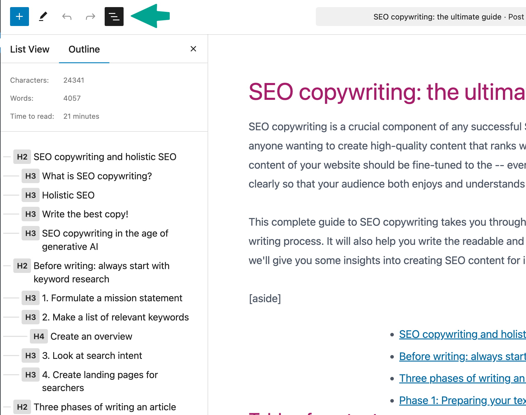
- Heading hierarchy: Ensure proper structure (e.g., H2s for main sections, H3s for subsections) and no skipped heading levels (e.g., jumping from H1 to H4).
- Duplicates or missing tags: Identify pages with multiple H1s or missing headings.
These issues can impact search engine rankings and user engagement. Document all findings in a spreadsheet, noting pages that need updates and prioritizing them based on their importance, such as high-traffic or core pages. If you need a detailed plan for optimizing these elements, see our SEO roadmap article for actionable next steps.

Checking canonical tags and addressing issues
Canonical tags tell search engines which version of a page should be prioritized when dealing with duplicate or near-duplicate content. This is particularly important for websites like online stores that often generate multiple URLs for the same product due to filters or session variables.
Assess your site for missing canonical tags, non-indexable canonicals, or conflicting tags. Tools like Screaming Frog or Semrush can help identify issues efficiently. Look for pages that lack canonical tags, pages where the canonical URL points to a non-indexable version, and instances where multiple conflicting canonicals are assigned to the same content.
Test schema markup
Schema markup helps make your site more understandable for search engines. The code you add to your site helps structure and identify your content in a way that search engines can easily consume. In some cases, this can even lead to highlighted search results, for instance, for products or ratings and reviews.
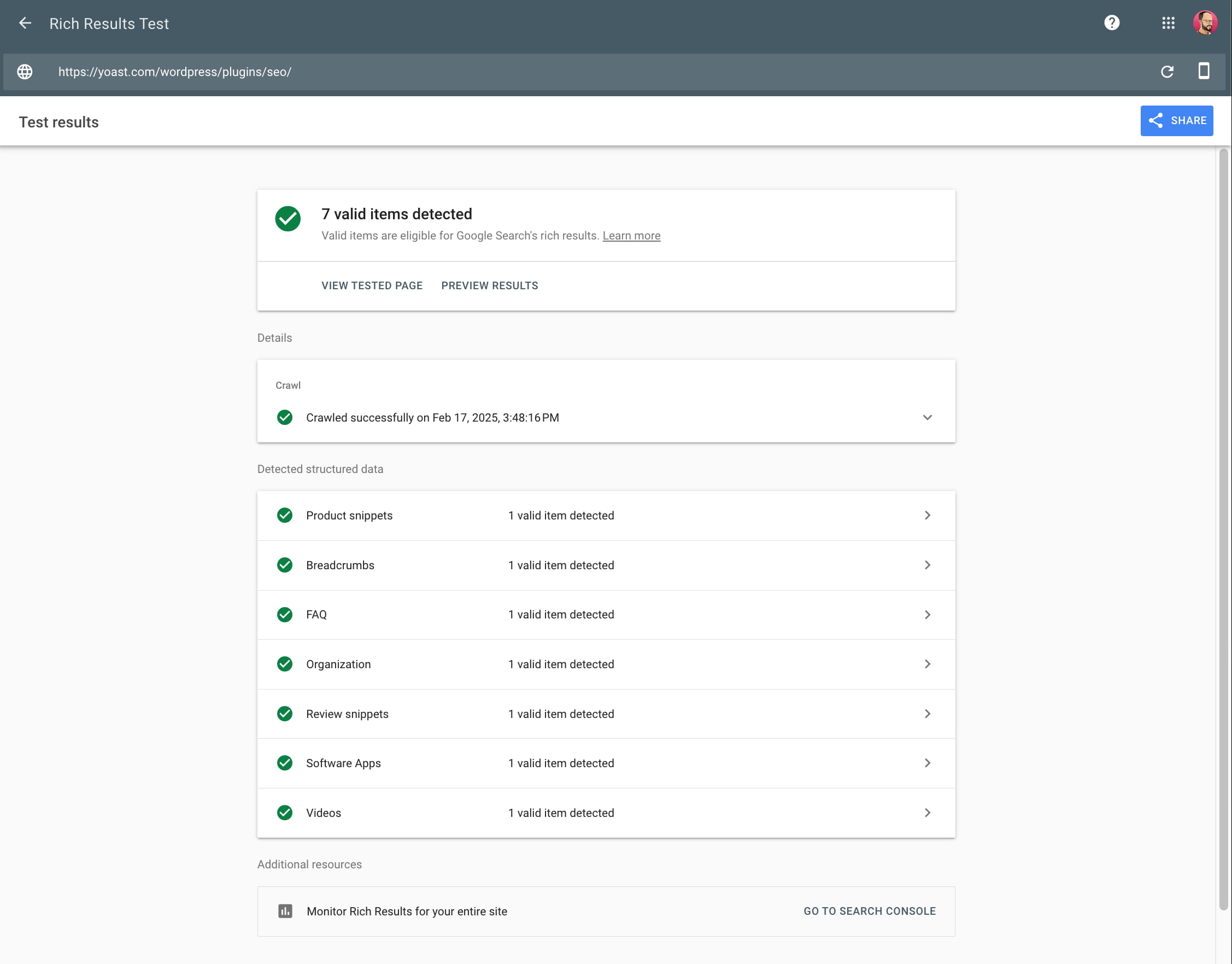
Don’t forget to test your structured data. Use Google’s Rich Results Test Tool to check if your structured data is correct and valid. Also, check Search Console for errors under the “Enhancements” tab.
If you are missing Schema altogether, we have good news! Yoast SEO drastically simplifies adding schema for WordPress, WooCommerce and Shopify users. The SEO plugin outputs JSON-LD (the format preferred by Google) to add schema markup directly to your page’s HTML — no coding required.

Audit and improve your backlinks
Backlinks are as important as ever. Every link from a relevant, high-quality source counts towards your authority. These links prove to search engines that your content is valuable and meaningful. Of course, there’s a ton of spamming happening with links.
SEO audit tools like Moz, Ahrefs, or Semrush can audit your backlink profile. The results show a list of spammy backlinks and links from irrelevant websites with low authority. If spammy websites link to you, there’s an option in Google Search Console to disavow these links. This is a last resort, though. You should only use the disavow tool if you have received a manual penalty from Google for unnatural links.
It’s more important to focus on earning high-quality backlinks. Create shareable, high-value content like guides, research, or infographics while building relationships with related websites, bloggers, or journalists for natural backlink opportunities. If your audit shows low authority scores, add a task to your roadmap for a detailed investigation and devise a plan to get high-quality backlinks.
If you’d like to analyze only a few pages and not your whole website, our SEO Checker might be for you. With this tool, you can easily scan your page and get a list of recommendations to improve your SEO.
Step 4: Site speed and engagement
Check your site performance, as site speed and user engagement greatly impact success. Pages that load slowly are annoying for users and can give you a poor score in the eyes of search engines. Low engagement rates can hurt your results, as users might stop visiting your site.
Understanding and improving Core Web Vitals
To underscore the importance of performance, Google launched the Core Web Vitals. These metrics help site owners gain insights into how their sites perform in real life and get tips on improving those scores. The metrics focus on loading times, interactivity and stability. Together, these determine how enjoyable users find your site. It’s easy to run a test, and you’ll get quality feedback about your site.
You’ll see suggested improvements, such as minimizing JavaScript execution, using browser caching, or deferring non-critical JavaScript. You can do a lot to improve your site speed, so once you have collected all the data, add it to your sheet with the rest of the tasks to tackle.
Checking site speed beyond Core Web Vitals
Core Web Vitals are a priority when analyzing page performance, but there are other areas to check to ensure your site delivers a fast and responsive experience. Faster websites lead to better user satisfaction, lower bounce rates, and a higher likelihood of visitors returning.
Check the number of HTTP requests your site makes, as too many can slow it down. Determine if CSS and JavaScript files can be combined or if modern HTTP/3 protocols are in use to allow multiple requests to process simultaneously. Review your files for unused CSS or JavaScript that could inflate load times and unnecessarily increase file sizes. Investigate whether file compression, such as Gzip or Brotli, is enabled to compress assets served to users. Tools like Google Lighthouse can detect if compression is missing and identify files contributing to slow load times.
Examine whether lazy loading is being used for images and videos, so only visible content loads immediately, with other assets loading as they are needed. Verify that lazy loading plugins like Smush or Lazy Load by WP Rocket are installed for WordPress sites. Alternatively, check if JavaScript libraries like lazysizes are used on other platforms. Make sure your site’s static assets are served through a Content Delivery Network (CDN), which delivers content from servers closest to users to reduce loading times. Providers like Cloudflare, Akamai, and Amazon CloudFront are commonly used. Lastly, you should run performance tests using tools such as Google Lighthouse, WebPageTest, or Pingdom to identify bottlenecks, ensure optimizations are in place, and track overall site performance.

Testing mobile performance and responsiveness
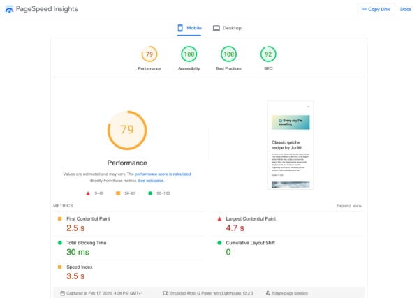
Mobile users drive traffic for most websites, so your site should perform well on phones and tablets is essential. To evaluate mobile performance, run tests using tools like PageSpeed Insights. These tools can help uncover layout issues, poor interactivity, and slow-loading assets on mobile devices. Pay close attention to whether responsive web design works correctly, meaning your site adapts to various screen sizes. Review CTAs and forms to confirm they are accessible and functional on mobile devices, especially ensuring buttons are easy to tap and forms are simple to fill out. Document any issues you find so they can be addressed during your site updates.
Testing engagement on your website
To understand how well your site engages users, use tools like Hotjar to analyze behavior, such as where visitors click, how they scroll, and which sections they interact with the most. Test your site’s navigation to ensure intuitive menus and internal search bars produce accurate results. Evaluate whether CTAs are placed effectively, particularly above the fold or after key content. Actionable CTAs should use language that encourages clicks, such as “Start Now” or “Learn More.” Run usability tests on internal links and related content suggestions to check if they guide users toward other relevant pages. Avoid heavy-handed popups—test exit-intent tools to ensure prompts or discounts aren’t disruptive. Collect insights from these tests to refine your site for better usability and interaction.
Step 5: Monitoring and tracking results
SEO is a colossal effort; the process does not end there once that initial effort is made. After the audit, you make a plan to tackle these issues, prioritize them, and then slowly do them or get other teams to do them (if you have people). Then, monitor your actions to determine whether those changes work as intended. Regular monitoring is also a great opportunity to find improvements and better calibrate your SEO strategy.
Regular monitoring helps you improve your site, adjust to the latest algorithm updates, and stay on course. For instance, you can set up automatic crawls to track the number of issues as you progress. If you work on the issues later, fewer and fewer issues should pop up, which should be reflected in the next crawl. However, new issues can surface if you add pages and products or do other work on your site.
Why monitor results?
By tracking results, you can measure the impact of your audit (e.g., increased rankings, traffic, and engagement). It’ll also help spot new issues like broken links, slow pages, or dropped rankings. This will ultimately help you improve your strategy by identifying what’s driving results and where to focus next.
SEO is not something you do in a month or so. It takes time, and you might see the results in many months. Consistently track and analyze.
Metrics to track in a site audit
Start by looking at traffic metrics. Organic traffic shows how many users find your site through search engines, which you can monitor in Google Analytics under Acquisition > Organic Search. Check referral traffic to see if other backlinks send visitors to your site. This data shows how effective your SEO and link-building work is.
Next, evaluate engagement and search performance. Metrics like engagement rates and time on page help you understand how users interact with your content. On the search side, track keyword rankings with SEO audit tools like Wincher, Ahrefs, or Semrush to see how well your pages are doing in the SERPs.
Use Google Search Console to monitor your CTR and check for indexing issues in the Coverage Report. Make sure that your most important pages are indexed. Monitor loading speed, interactivity, and layout stability in tools like PageSpeed Insights.
This is the same data we used when we started the audit, but now, you should look at the results of the improvements. Once improvements are made, you should monitor their performance for quite a while, as some can take a long time to take effect.
Schedule regular check-ins
You need to monitor results regularly. Review rankings, CTR, and new crawl errors weekly. Each month, check traffic trends, user behavior, and fixes made after the audit. Every quarter, you should run a fresh crawl with Screaming Frog, but keep in mind that running full scrawls is time-intensive. At least check your most important pages often. Also, check competitor performance and update old pages based on new opportunities.
Conclusion on doing SEO audits
Conducting an SEO audit might seem overwhelming, but it becomes much easier with a structured approach and the right tools. Audits help you uncover issues and areas of improvement so you can tackle them effectively. Stay consistent with your audits, and you’ll be on your way to a stronger online presence!

